Off The Cuff: Verbatim

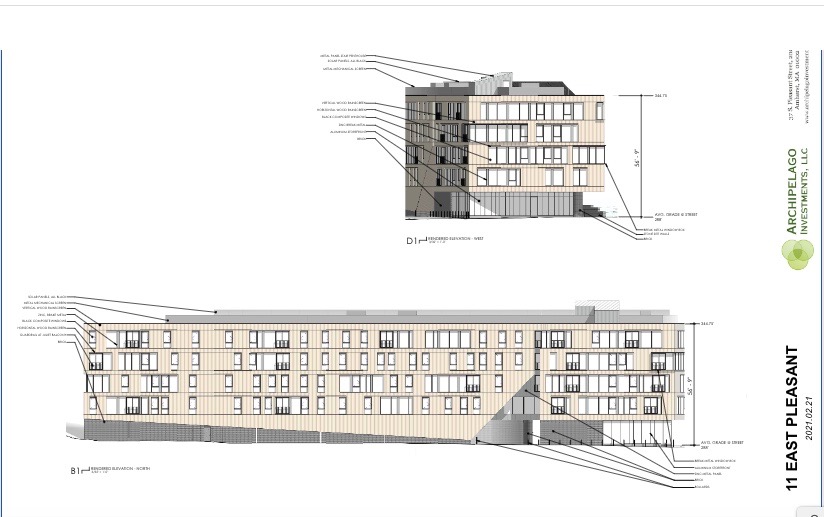
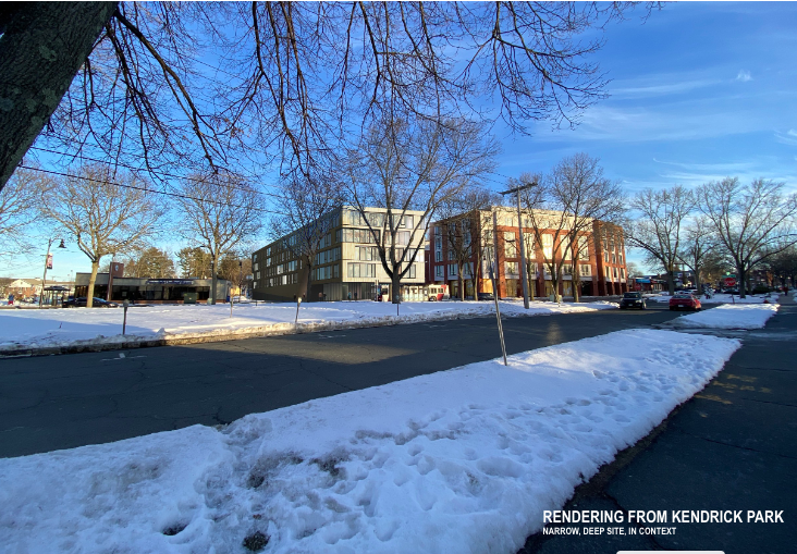
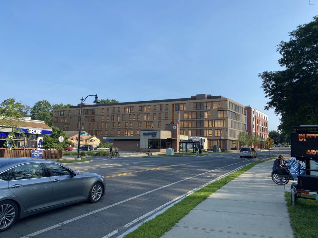
Architect's rendering of 11-13 East Pleasant Street. Top: front of building. Bottom: view from North. Photo: amherstma.gov
A Play In Three Acts Using Snippets From Design Review Board Meeting Of July 19, 2021 (5:00-7:30 p.m.), Recorded And Continued From May 10

Cast of Characters
Kyle Wilson, key principal and manager of of Archipelago Investments, LLC, developer of Olympia Place, Kendrick Place, Boltwood, One East Pleasant Street, AmherstWorks, 26 Spring Street
Jan Marquardt, former professor of Visual Arts, Art History, Women’s Studies; representing the Historic Commission
Catherine Porter, Chair, Design Review Board
Erika Zekos, lecturer in the Department of Architecture
Lindsay Schnarr, Master in Architecture (UMass-Amherst), has taught Analysis and Representation, as well as Design at UMass
Thom Long, Associate Professor of Architecture and Design at Hampshire College, representing the Planning Board
Maureen Pollock, Staff Liaison
Christine Brestrup, Planning Director, Town of Amherst
Act 1: The Evidence


Act 2: The Questions and Commentary
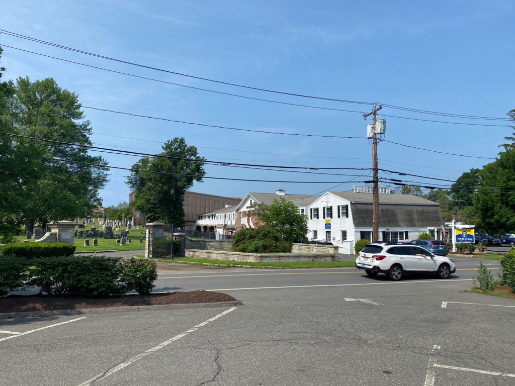
Kyle Wilson: The changes I have made since May are increasing the east setback from the cemetery from five feet to ten, improving the streetscape, increasing the number of units from 55 to 90, adding 11 affordable units. Six ground floor units replace the parking.
Jan Marquardt: (historian representing the Historic Commission): I want the trees on the Town side of the cemetery fence not on your side.
Wilson: I want trees on both sides. I want to proceed with the project! I want to make everybody happy. I will defer to Alan Snow [tree warden].
Catherine Porter: I think that we should go through the Design Review Standards [that were] added to the zoning bylaw in October of 1983. Let’s take them one at a time.
Scene 1
Porter, reading from Amherst’s zoning bylaw: “The HEIGHT OF THE BUILDING should be compatible with the style and character of the building, structure, or site being altered and that of the surroundings”
Porter, commenting: The height is not compatible with the buildings to the north, particularly the Jones [Pray Street] block.
Erika Zekos (reading from prepared notes): The 57-foot height of the building is compatible with the building type and structural system. Yes, the height is compatible with the church steeple, and development to the north is likely. I feel that it is sensible to see these similar-height buildings clustered together in an urban gesture, across the street from the park, so that they don’t create a canyon-like effect. The building height here also mirrors the height of the mature trees across the street in Kendrick Park. It is sensible to see these similar-height buildings clustered together in an urban gesture.
Lindsay Schnarr: This part of town hasn’t been maximized yet. It is in a transitional state. Needs “stepping” to create a relationship to what’s there but it’s not such a massive block that I will request [changing] it.
Thom Long: This building is progressing toward the scale I want to see.
Marquardt: I agree with Lindsay [Schnarr], but the retail façade is not enough and makes the façade look taller. Make it more open and welcoming. The second floor goes all the way to the street. Maybe two floors should be open.
Porter: The height is a very abrupt change from the buildings to the north. There are no plans now for I developing these parcels. I would prefer a lower height.
Scene 2
Porter, continuing to read from zoning bylawPROPORTIONS OF THE BUILDING and relationships of height to width between windows, doors, signs, and other architectural elements should be compatible with the architectural style and character of the building or structure and that of the surroundings.
Porter: There are a lot of windows, which break up the wall, but their placement is not compatible with the building next to it. I hope there will be draperies or blinds so I don’t see into the units [as I drive into town]
Long: I see continuity with the storefront glass [next door]. The proportion of glass to solid is good.
Zekos: Amherst’s downtown is an eclectic mix of building style, size, and materials, the proportions of this building are appropriate and reference the rhythm and pattern of apertures and shallow brick detailing in 19th-century buildings nearby. This is a contemporary interpretation and is appreciated here in this transitional lot between high and low, oldish [sic] and new.
The design creates a first-floor plinth with a higher ceiling and increased openness at the street, which is suitable to a commercial scale, and that carries the height of the adjacent bank. It then stacks smaller scale openings above, which are appropriate for the residential scale.
I appreciate the use of materials — brick, wood, and zinc— to create variety, shadow lines, and patterns. The variety generated within a limited palette of window groupings is restrained but dynamic, and emphasizes the horizontal axis. As do the horizontal reveals at each sill line. The generous windows project the residential program of the interior and serve to lighten the mass of the building. In addition, the “cuts,” in plan at the East Pleasant Street sidewalk and on the north and south facades help to break down the overall length into proportional segments.
There is still concern that the building feels looming and large from the north. But my previous comments about the overwhelming gesture of the north-facing elevation have been largely addressed by the creative use of materials and wall plane manipulation at the east end to break down the 200-foot “body” of the building. The zinc-clad “gash” that separates the “head” and the “body” of the building is, in my opinion, not significantly wide enough at only two feet seven inches on the upper floors.
Scene 3
Porter, continuing to read from zoning bylaw: THE RELATION OF STRUCTURE AND PLACES to the open space between it and adjoining structures should be compatible with such relations in the surroundings.
Marquardt: Trees are needed on the north side.
Zekos: A particularly strong move is the recessing of the first-floor retail space to create a generous extension of the sidewalk at the west side of the property. This setback receives the line of Hallock Street and creates a plaza space for gathering — in front of the building — which could be used for sidewalk sales, seating, etcetera The new crosswalk is appreciated here as well. While I like the gesture of creating an extension of the sidewalk, the 424-foot plaza space feels small given the use and density of the building. I would call again for an extension of the plaza to the south, into what is currently shown as a planted area.
To the south side, the building is well-situated and makes the most of the setback space. This space creates a visual link from Hallock Street to the cemetery. It will be planted and also creates a soft buffer between the adjacent One East Pleasant Street property.
The very narrow setback on the north side of the building limits options for planting to soften the transition from high to low lots, which is unfortunate.
Overall, the solid/void relationship of the facades is a well-composed and dynamic composition.
Scene 4:
Porter, continuing to read from zoning bylaw: SHAPE of roofs, windows, doors, and other design elements should be compatible with the architectural style and character of the building or site, and that of its surroundings
Schnarr: The building needs some articulation, particularly on the north side.
Marquardt: I like the cleaner Bauhaus lines.
Scene 5
Porter, continuing to read from zoning bylaw: LANDSCAPE should be compatible with the character and appearance of the surrounding area. Landscape and streetscape elements, including
topography, plantings and paving patterns, should provide continuity and definition to the street … pedestrian areas
Porter, commenting: Design needs some plantings on the north side. How can anything grow in the 10 to 12 feet between this building and the one to the south? The trees are deprived of sunlight.
Maureen Pollock: Alan Snow [tree warden] says they will do just fine, like in shady forests.
Christine Brestrup: They aren’t Norway maples, an invasive species. They are Armstrong maples, which grow 18 feet tall in a columnar shape.
Long: The landscaping mimics the language we see downtown.
Marquardt: It should have branching shade trees on the west for a softer look than the verticals.
Wilson: We will plant whatever Alan says.
Marquardt: Don’t grant the variance. Keep the 20-foot setback on the cemetery side.
Wilson: A 20-foot setback makes downtown undevelopable.
Zekos: The landscape design for this building manages the grade change and drainage issues between the One and 11 East Pleasant sites deftly with the introduction of granite retaining walls that serve to define the property and create some visual interest in the planted buffer. The planted strip of maple trees and red twig dogwoods is clean and maintains a sight line to the cemetery from the sidewalk.
I would like to see the planted area and the first granite wall pushed back [all the way] to the lot line to expand the public way on the east side. The granite wall nearest the sidewalk should be designed to be seating height.
I am intrigued by the identification of a large boulder “art” feature in the plaza area. Lighting fixtures are consistent with the design language. DRB [Design Review Board] requested additional information about lighting levels to provide a safe environment, but also to reduce light pollution. As the applicants point out, LEED certification demands that the design minimize light pollution.
While the sidewalk width is only five feet, the extension of the hardscape on either side accommodates the use and density of the building. Sidewalk design should continue the town’s plan for sidewalk plantings, bollards, tree grates, bike racks, benches, etc. that we see farther to the south.
Scene 6
Porter, continuing to read from bylaw: SCALE of a structure or landscape alteration should be compatible with its architectural or landscape design style and character and that of the surroundings. The scale of ground-level design elements such as building entryways, windows, porches, plazas, parks, pedestrian furniture, plantings and other street and site elements should be determined by and directed toward the use, comprehension and enjoyment of pedestrians.
Zekos: The human scale of the building — in other words, the relationship to the pedestrian primarily at the first level, is appropriate and even playful.
Scene 7
Porter, continuing to read from bylaw: DIRECTIONAL EXPRESSION Building facades and other architectural and landscape design elements shall be compatible with those of others in the surrounding area with regard to the dominant vertical or horizontal expression or direction related to the use and historical or culture character, as appropriate
Scene 8
Porter, continuing to read from bylaw: ARCHITECTURAL AND SITE DETAILS including signs, lighting, pedestrian furniture, planting and paving, along with materials, colors, textures and grade shall be treated so as to be compatible with the original architectural and landscape design style of the structure or site and to preserve and enhance the character of the surrounding area. In the downtown business districts, these details should blend with their surroundings to create a diverse, functional, and unified streetscape.
Marquardt: I continue to value the [architectural] differences between the east side and west side of Kendrick Park.
Porter: The west side is in peril. I am concerned about the longevity of the cedar siding. How can we be sure it will hold up with dignity as long as the building is alive? This is a big building if the siding goes bad.
Wilson: It is Alaskan Yellow Cedar, a natural material. We will pre-gray it with Cabot bleaching stain.
Porter: Have you used it before?
Wilson: The same wood is used on Kendrick Place and One East Pleasant Street. We are using the granite from the same quarry as Kendrick Park.
Zekos: The horizontal expression of this façade is emphasized by the sill-line reveal and by the diagonal line demarking the shift of brick to wood that characterizes the first floor on the north and south sides. The recessed expression of the ground- floor retail and its treatment in glazing and brick also increases the hierarchical expression of the first level, consistent with adjacent buildings.
Porter: The building sticks out like a sore thumb.
Wilson: We own five parcels. We don’t know what we will do there.
Porter: I regret that the architects did not come to Amherst. It just doesn’t fit where it is. It is a real jolt. We have to be sensitive to the comfort level of the people of Amherst. It has interesting features but I wish it wasn’t there.
Scene 9
Porter, continuing to read from bylaw SIGNS The design of signs should reflect the scale and character of the structure or site and its surroundings. Signs should simplify and clearly identify individual establishments, buildings, locations, and uses, while remaining subordinate to the architecture and larger streetscape.
Developer has requested a sign waiver.
Members of the public who spoke during the public comment opportunity (the Greek Chorus) were Pamela Rooney, Dorothy Pam, Ira Bryck, and Hilda Greenbaum. The comments emphasized that Erika Zekos “isn’t seeing the same building as the rest of us” and included statements that the building “looks like a massive hulk from the north, perhaps there could be a 20-foot setback to the cemetery if the upper floors were cantilevered over the bottom floors,” and that “there needs to be some articulation to break up the 200-foot north façade.” Other comments were, “Don’t try to cover up architects’ mistakes with trees,” “If families are to live downtown, they need parking for their cars, vital for shopping, taking kids to lessons, appointments,” and “An interesting downtown could benefit the colleges by attracting and recruiting good students.
Act 3: The Denouement
Board: We recommend acceptance of this project but we have concerns that haven’t been addressed by the developer.
1. The tree warden will plant the trees on the cemetery property but the developer will pay [for labor and materials].
2. Drapery or blinds for all windows
3. Keep the granite boulder as public art.
4. The appearance of the Alaskan yellow cedar over the life of the building.
5. Different varieties of shade trees along East Pleasant Street according to Amherst’s planting plan.
6. Consider a stepback on the street façade and do something to break up the north mass. We need to fix this now since we don’t know when other lots will be developed.
7. Ms. Marquardt is concerned about setting precedents, that Planning Board hasn’t paid attention to DRB to our recommendations in the past and Ms. Zekos suggested a greater street setback though “that might kill the project.” But Mr. Long contends that the 10-foot difference in setbacks is not perceptibly different from 20feet at a distance.

Critics pile praise upon the new play:
Hilda Greenbaum joins Samuel Beckett, Eugène Ionesco, Jean Genet and Harold Pinter!!!!!
— Martin Esslin
… the building reminds me of the young Kavanaugh at Yale.
— Eric Bentley
We look forward the film version, starring the World Trade Center, lying on its side….
— Vincent Canby
It isn’t Shakespeare, Hilda, but it certainly is a tragedy. One more death knell to Amherst’s downtown vitality.
Listening to the architectural doublespeak of one committee member, I thought I was reading about a ballet with “gestures” of this and that in “hierarchical expression” with occasional “softening” and “references the rhythm and pattern of apertures” with “the solid/void relationship of the façade in a well-composed and dynamic composition.”
I am reminded of museum labels to art works which often use insider language to “elucidate” the piece to the “uninformed” reader. We residents of Amherst are not uninformed. This latest proposed building is exactly what a different committee member described in the simplest, most effective language. “It sticks out like a sore thumb.”
Archipelago’s latest proposal is boxy out-of-scale rectangular prism, a pseudo-Bauhaus monolith more appropriate to the Brutalism architectural movement which dominated UMass in the 1950’s to 1970’s.
Why can’t the majority of the Town Council realize we need to take the time to create zoning by-laws that will satisfy Amherst’s permanent residents as well as developers? Archipelago wants what is has always wanted on their lots – the most apartments and the least retail space and to hell with setbacks, parking, greenery, streetscape, etc. And sadly, the majority of the current Town Council is letting them have it, while the town receives less than ideal tax compensation for so much lost.
We need wise development. We don’t need imaginary “gestures.”
As Terry says, it may not be Shakespearean, but perhaps it is Aristotlean. Catherine Porter is a tragic hero – heroic because she understands the importance of downtown to the whole of Amherst and because she has a vision for its further development that would make that happen. Tragic, because the “tragic flaw” is that the Design Review Board has no real power and the direction for downtown was pre-ordained even before the Town Council took office. That is what Amherst Forward is all about.
Terry asks why the majority on the Town Council cannot realize the common sense approach of completing the revision of the Zoning Bylaw before issuing new building permits. The answer is that the majority of Town Councillors are not free agents. Remember the vision of an urban corridor along North Pleasant Street that Jerry Guidera presented to Town Meeting. We were all forewarned. Our response will have to be at the ballot box in November.
Here is a thought to consider. Perhaps the north end of downtown is a “lost cause”. Perhaps we just allow that end of town to become a dormitory clustered “dead zone”. Let it spread north to the location of the former Gateway project toward UMass. Do rezoning to save the remaining downtown while allowing Archipelago to maximize it profit by minimal or no commercial space requirements. But insist on our fair share of the profit by getting them to build a parking garage for all those hundreds of units.
At the same time, the CRC, the Planning Board and the Planning Department need to spend more time, attention and creative energy figuring out how to encourage robust small scale local organic growth. We need to greatly diversify the kinds of development we encourage and we get. One unit of housing of the current variety earns the town about $2000 in tax revenue for $20 000 in rent receipts. Good in one sense, but $18,000 of local spending leaves town. In the case of a small scale owner occupied duplex project that might yield similar income and tax benefit, much more if not all of the remaining $18,000 might remain in town. WOW! There is enormous untapped potential resource for economic vitality. This type and scale of development brings a broader more diverse range of housing options, including middle income and affordable housing. Development of this type and scale will also bring more architectural diversity, expressing and enhancing our unique local character.
Bob’s comment may capture the macroeconomic essentials of what’s going on here: Amherst has become a “mining town” and these housing projects are “rent mines”!